Nike Reveals The Paris Edition From The New Family Reunion Pack
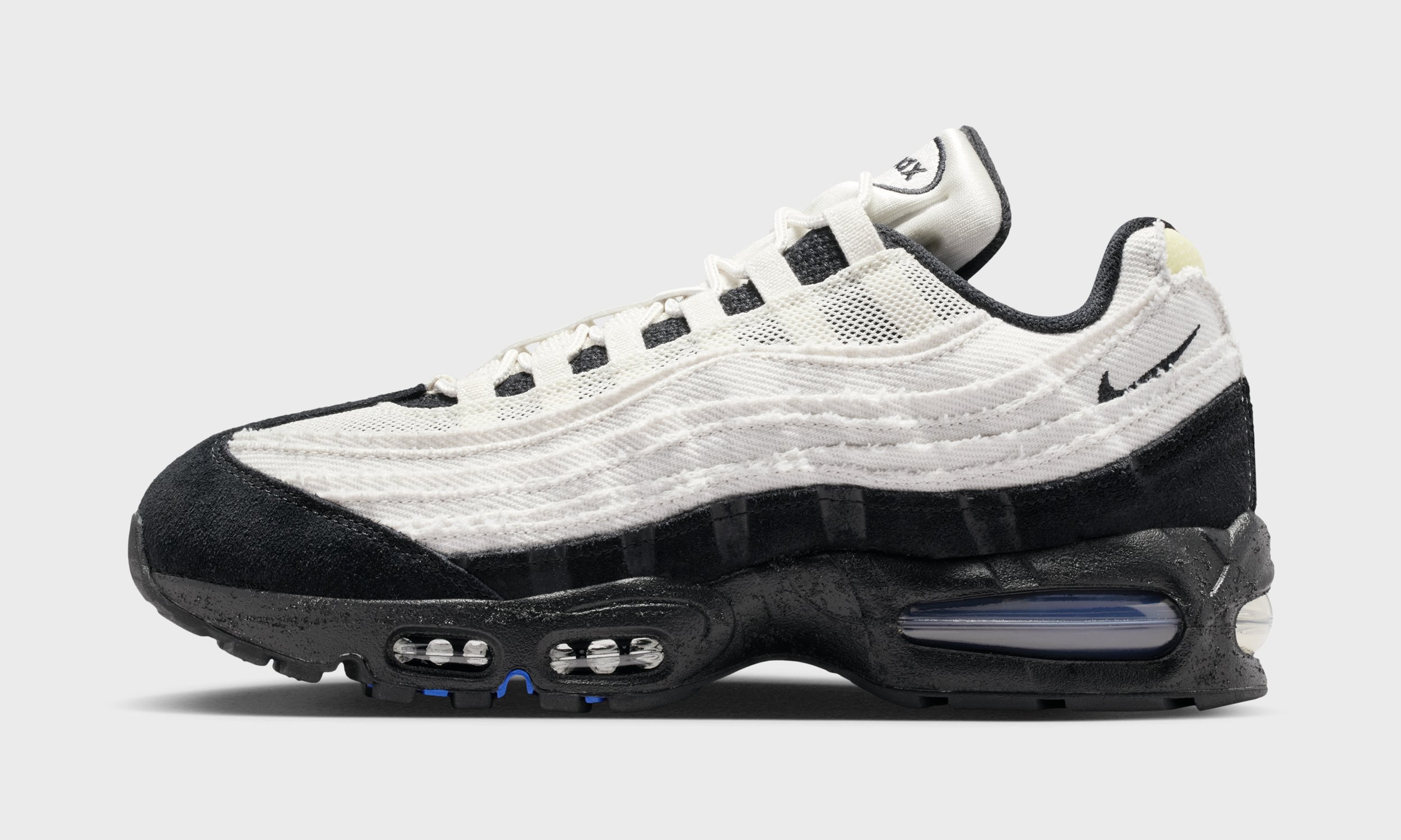
For this latest iteration of the Air Max 95, Nike moves away from polished retros and obvious color storytelling and instead focuses on something more fundamental: the process of making.
The “Family Reunion” Pack links four global regions, North America, China, South Korea, and Paris, through a shared design language rooted in craft, construction, and community. Rather than leaning on loud graphics or literal symbols, the collection communicates through texture, materials, and exposed details, turning the iconic runner into something that feels assembled by hand instead of stamped off a line.
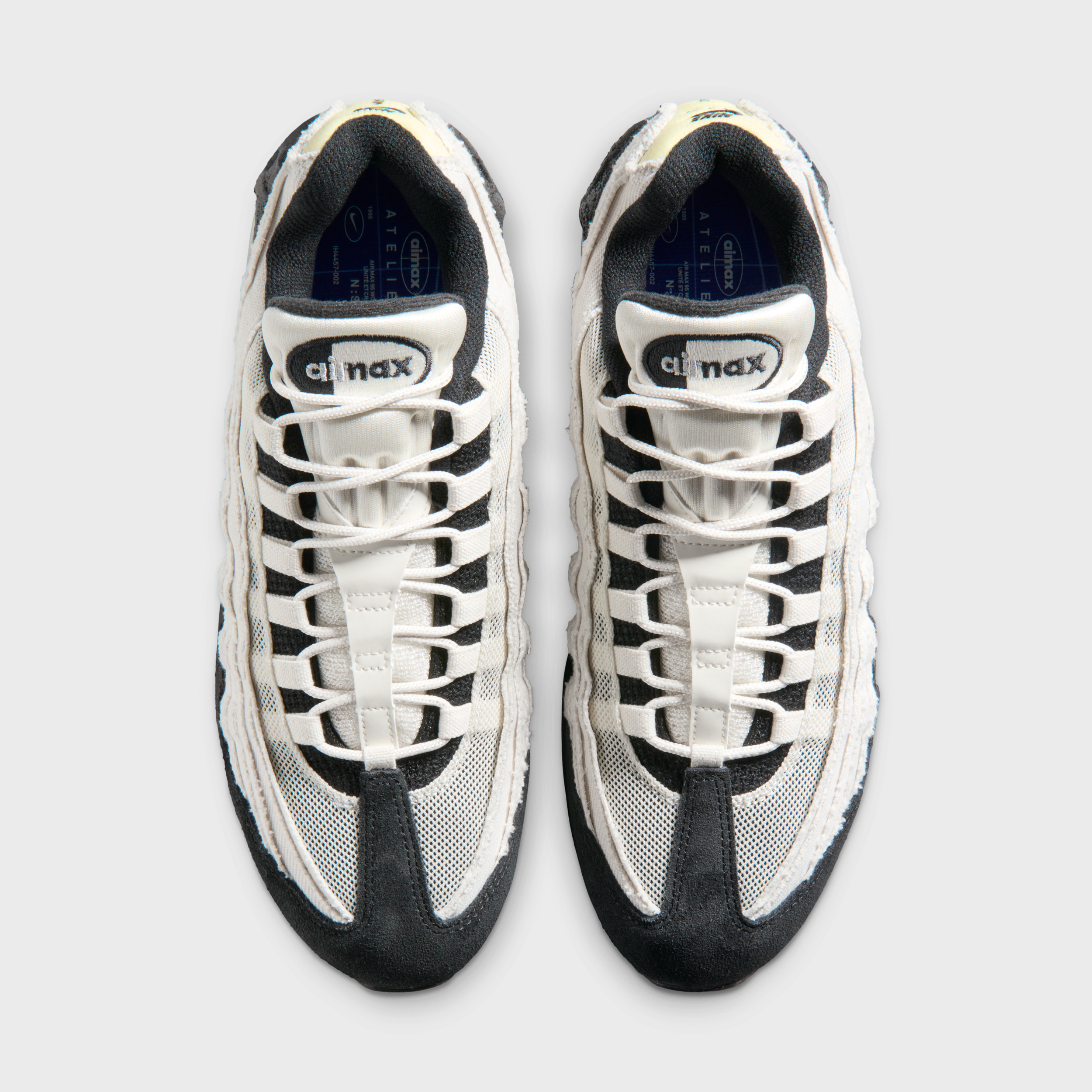
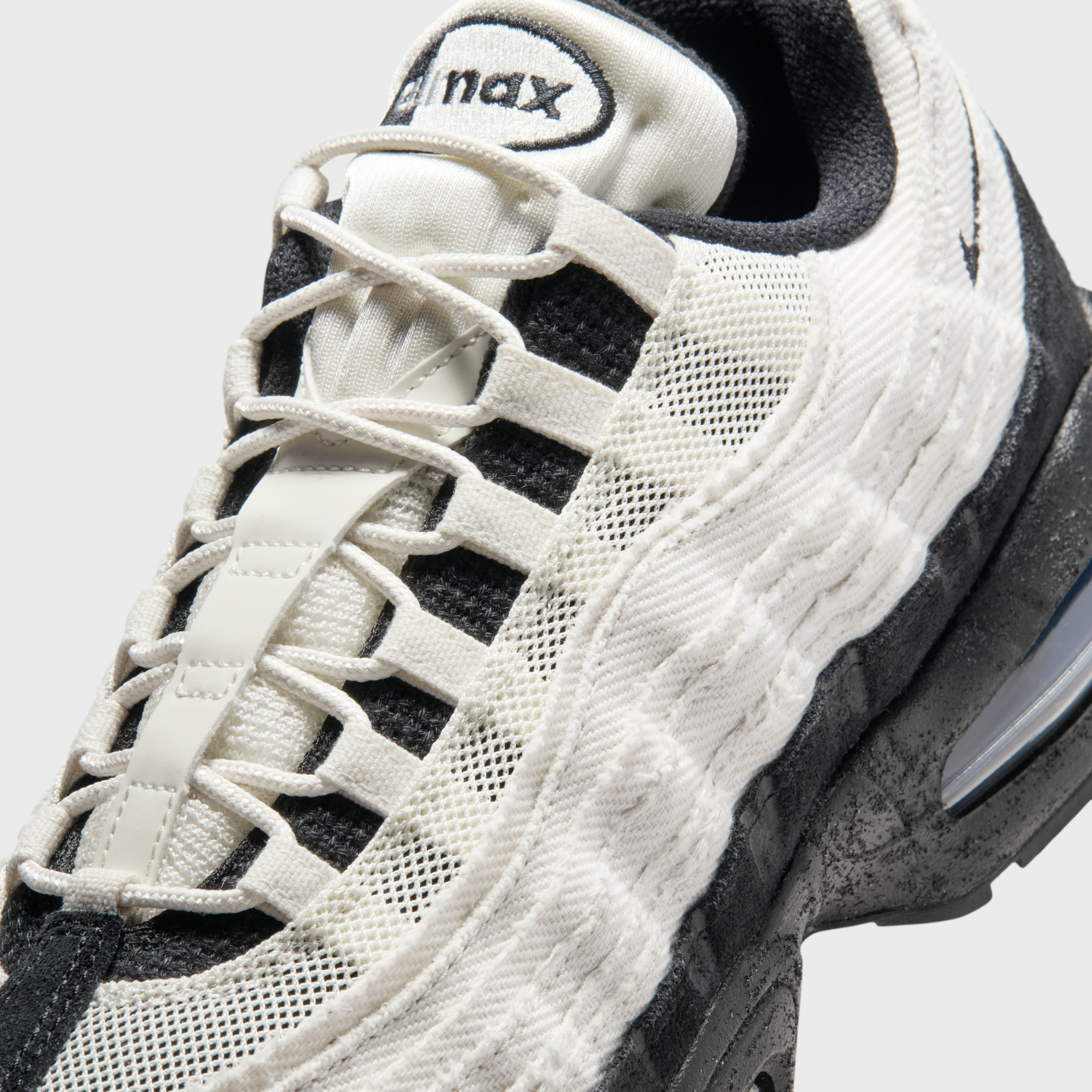
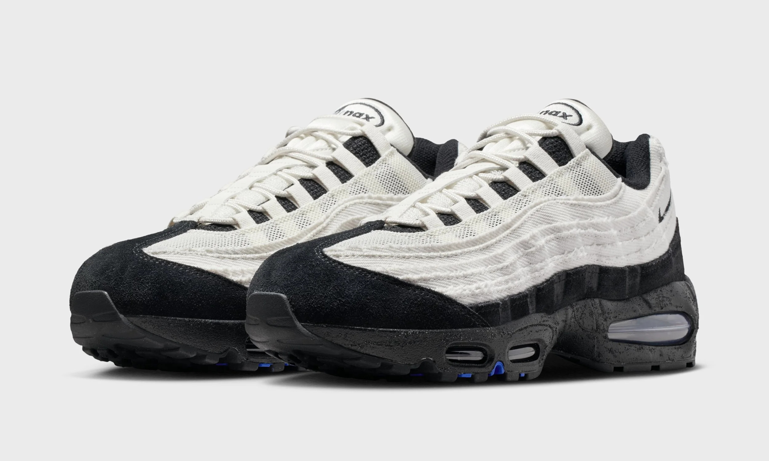
Across the pair, the Air Max 95’s signature layered upper is rebuilt with raw textiles, open mesh, heavy canvas, and rugged suede, replacing smooth, traditional finishes with fabrics that feel tactile and honest. Edges are intentionally frayed, stitching is left visible, and panels look cut and reconstructed in a workshop setting. The imperfections feel deliberate, celebrating process over polish.
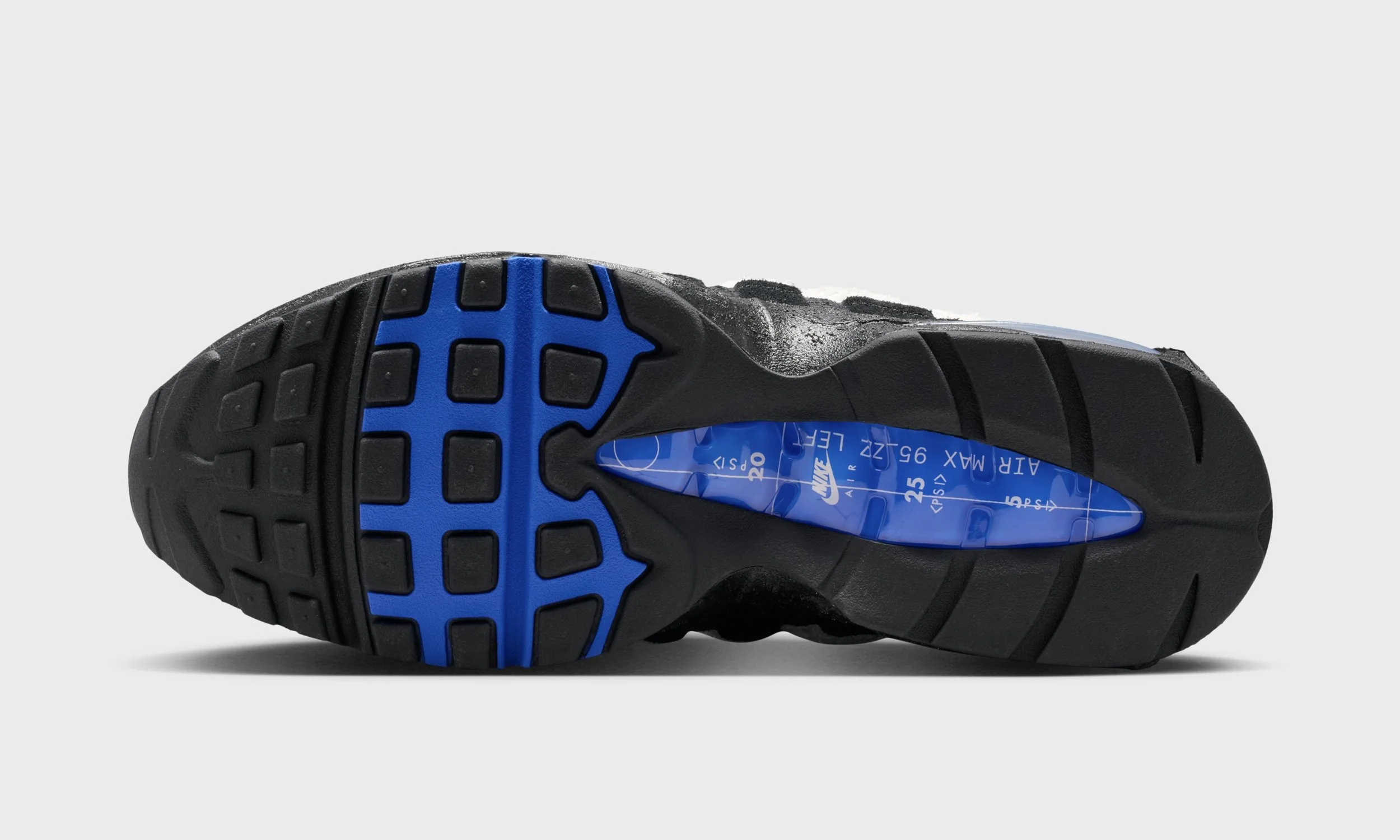
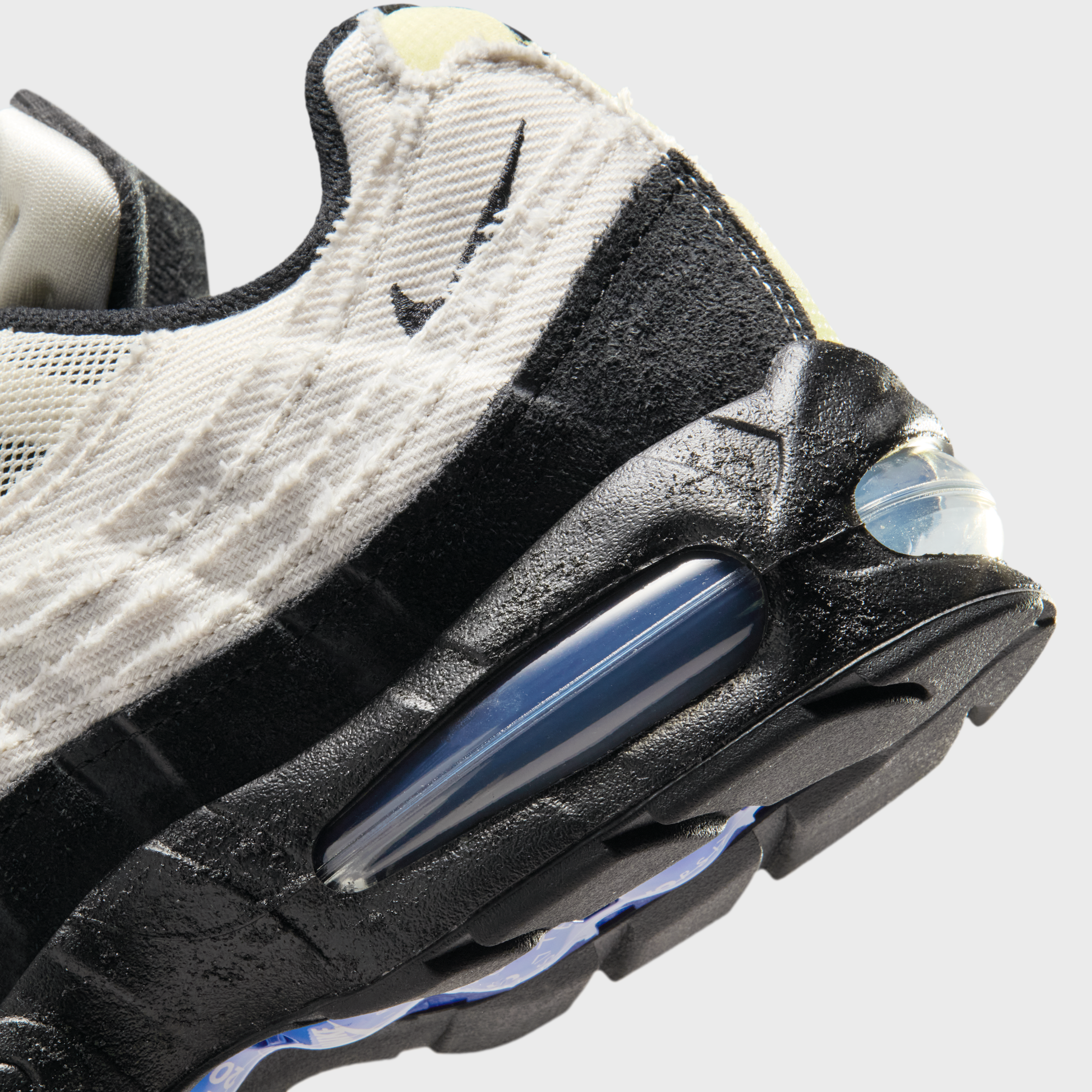
Underfoot, the midsoles take on a grainy, stippled texture with a distressed, almost concrete like finish. The rough treatment adds depth and character, echoing the surfaces of the city itself and giving each pair a worn in feel straight out of the box. Functional touches like exposed webbing lace loops and durable mudguards reinforce the utilitarian, tool-like mindset.
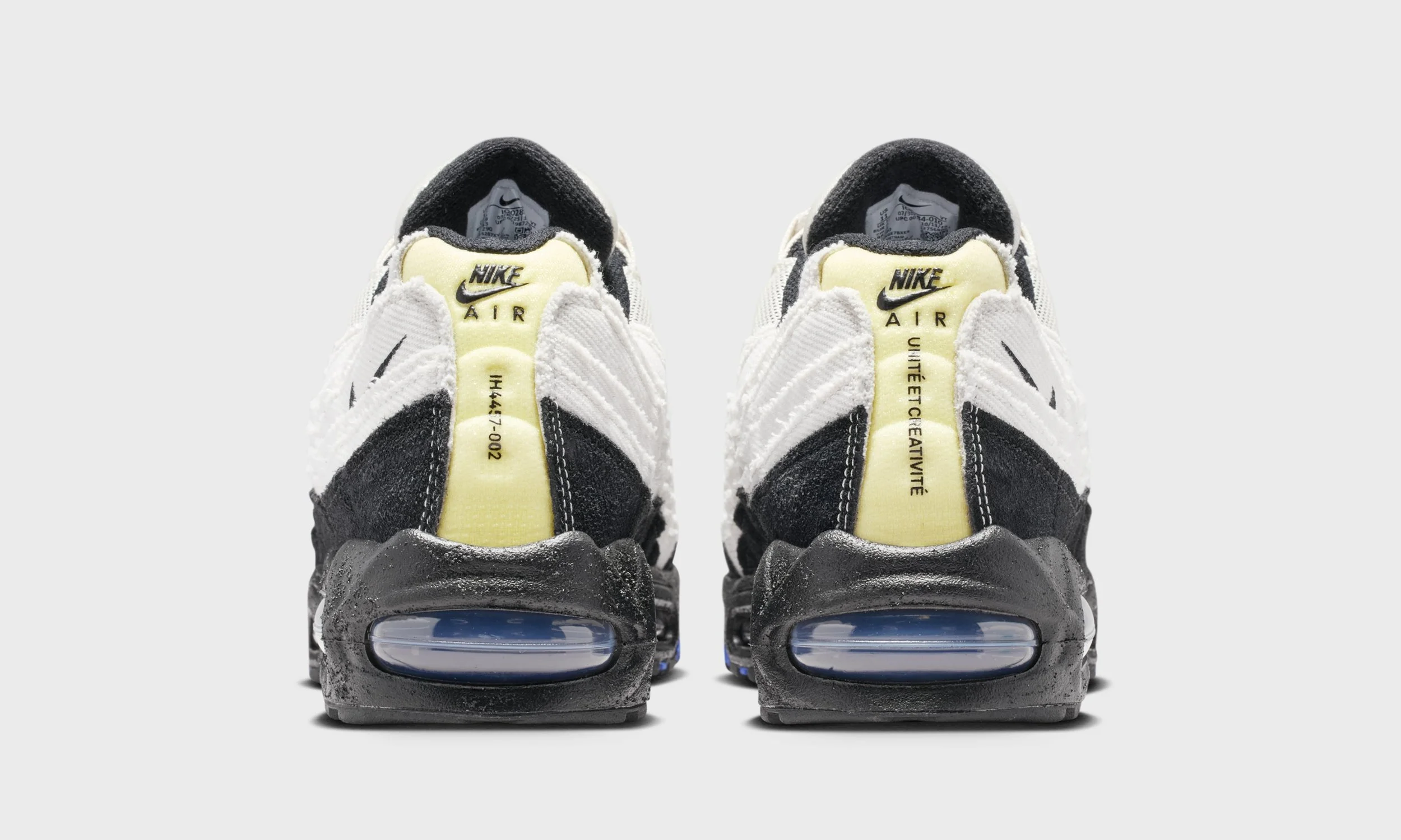
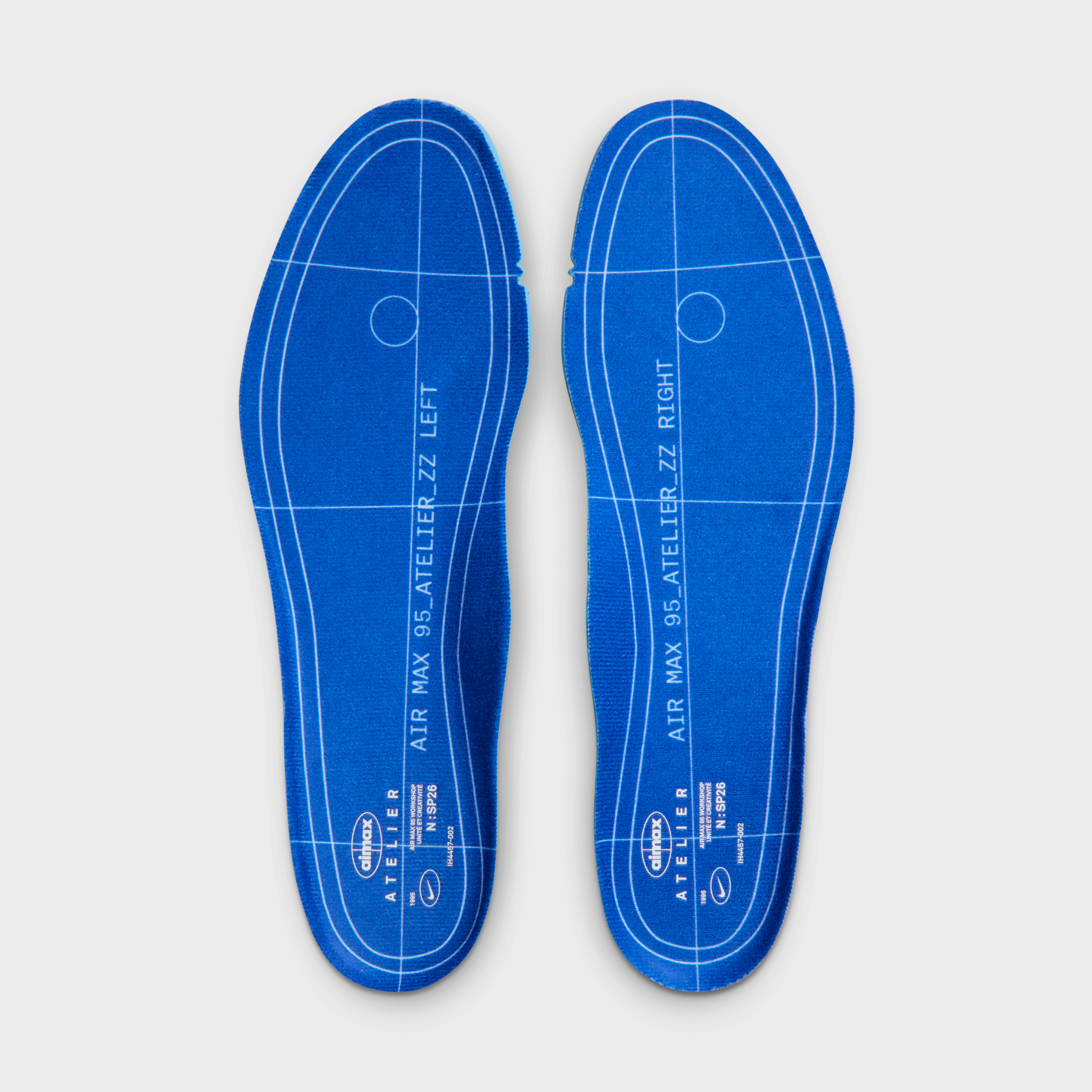
Inside, the theme becomes even more literal. Blueprint-style insoles labeled “Atelier” reference the design studio, complete with measurement lines and technical markings, as if the shoe is still in development. It’s a nod to pattern making, prototyping, and the behind the-scenes work that usually stays hidden.
That balance between production and creativity shows up elsewhere, too. One heel is printed with an exposed SKU code IH4457-002, the same code associated with last year’s Bright Crimson Air Max 95. How that exact style number connects to this pair isn’t entirely clear, but its visibility feels intentional, like a factory stamp left on the outside as part of the design language. On the opposite heel, the message shifts from technical to human: “Unité et Créativité”, Unity and Creativity, a simple phrase that captures the spirit of the collection and the idea of different communities building something together.
It’s this contrast that defines this pair. Blueprints and barcodes. Workshop textures and shared values.
Each city interprets the same foundation in its own way, but they’re all connected by the same DNA, like a family reunion told through materials instead of graphics. Four regions. One silhouette built from the ground up, with unity and creativity at the core.
A February release is scheduled for this pair but stay locked to the 110slad socials for more updates.